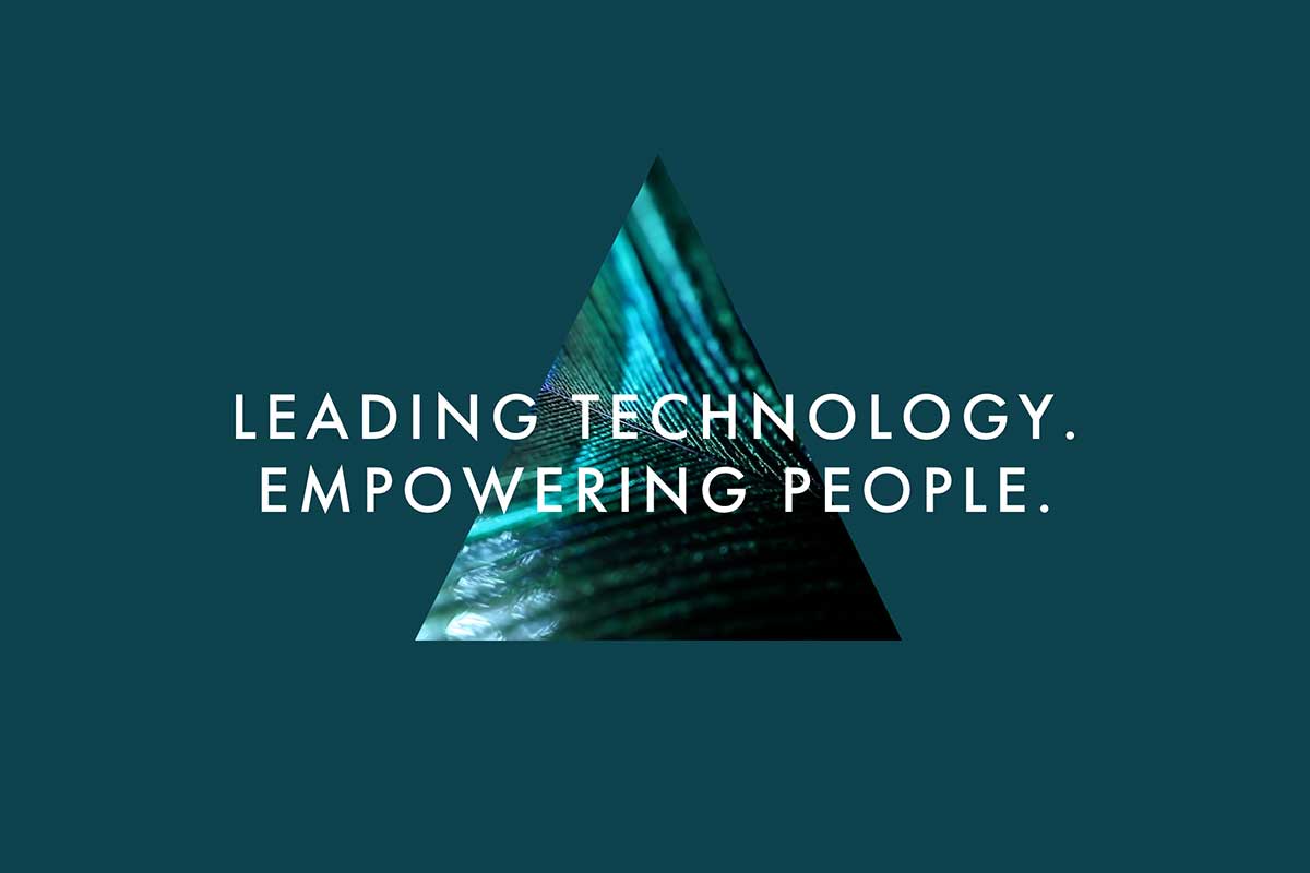
Homepages are often judged instantly, based almost entirely on aesthetics. An impactful banner image, a vibrant colour palette or a slick animation but the real story is the structure and strategy behind those pretty pictures.
So let’s peel back the metaphorical skin and give you a glimpse into the underlying anatomy of the Panacea homepage.
Panacea is a software development company that creates modular software. Their offer can initially appear complex, with a wide range of potential customers, products and use cases. When mapping out a homepage like this, the important questions we’re normally wrestling with are:
- What does the page need to do?
- In what order does the visitor need to understand things?
Our job as information architects is to create simplicity and order out of complexity.
The homepage’s job is to give site visitors a guided route through Panacea’s offer. Here’s the logical structure and flow behind that sits behind our design.
The structure behind the page
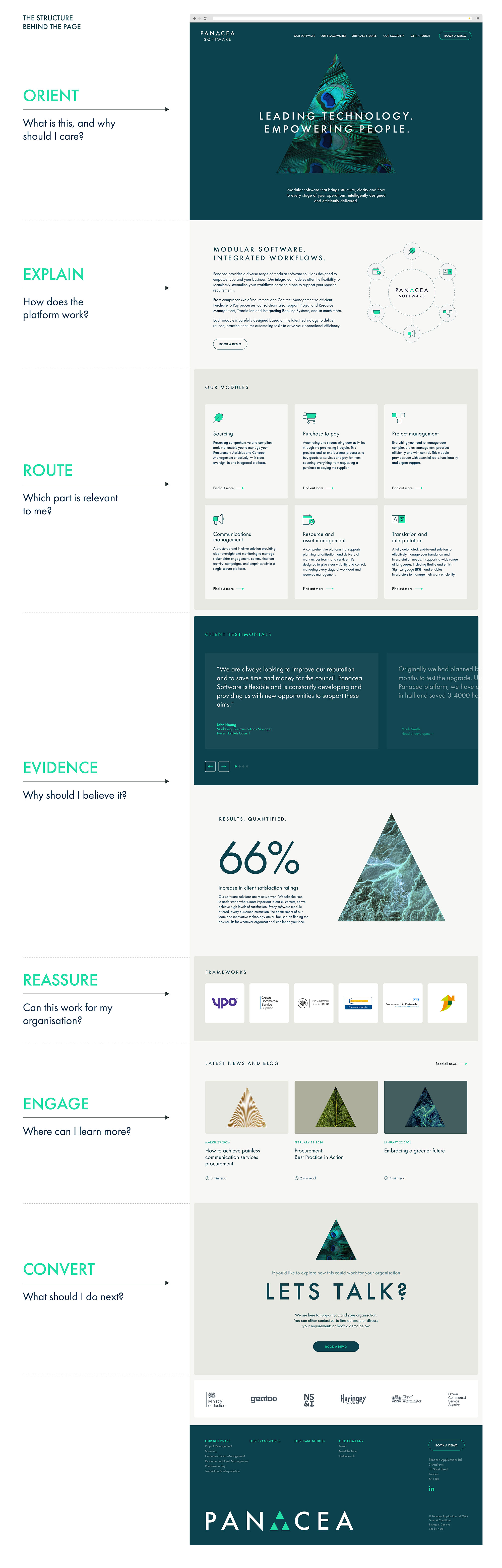
Start with a broad contextual framing
The opening headline, “Leading technology. Empowering people.”, is a core brand statement that sets the homepage up around a founding belief: that the value isn’t just in the software itself, but in what that software enables:
- Clearer processes. Better workflows. More time for people to focus on the work that matters.
The headline and supporting text frame the offer. Yes, this is a technology company, but it is ultimately about helping people work better. A homepage needs to strike a careful balance: enough brand to convey a point of view, and enough clarity that visitors immediately understand why it matters.
Then make the offer easier to navigate
Once the overarching concept is clear, the page introduces the platform as a connected system.
This is a deliberate step. Before introducing the individual modules, we need visitors to understand that those modules fit into a bigger whole. We need them to see the wood before they see the trees.
The modules section then breaks the broad offer down into more recognisable entry points, allowing visitors to quickly identify the areas most relevant to their specific needs. This section is doing a lot of heavy lifting, because it is often here that visitors will identify the exact part of the offer that relates to their own requirement.
Build confidence before asking for action
This is where a lot of homepages trip up. They ask for the enquiry before they have built enough confidence.
For Panacea, the testimonials and quantified results shift the message from “this is what we do” to “this is what it achieves.”
Potential buyers need to get a strong sense of the tangible return on their investment before taking action. That is true almost anywhere a purchasing decision is being made.
The frameworks section then answers another important question: can this actually be procured?
For public sector audiences, that is not a small detail. Showing that Panacea is available through recognised procurement frameworks helps remove a practical barrier. It can be the difference between interest and action.
Make the next step feel natural
By the time the visitor reaches the final “Let’s talk” call to action, they have been orientated, guided, reassured and given evidence to believe the product could benefit them.
That’s what a good homepage should do.
Not just look polished, but move visitors through the right argument, in the right order.